
Choosing where to buy property in London, whether as a rental or a home for yourself, requires careful consideration of many different factors. We explore seven unique maps that give buyers easy access to the invaluable insights that Big Data can offer.
Read Buy to Let Hotspots London here.
Which areas will grow the most?
GLA population projections
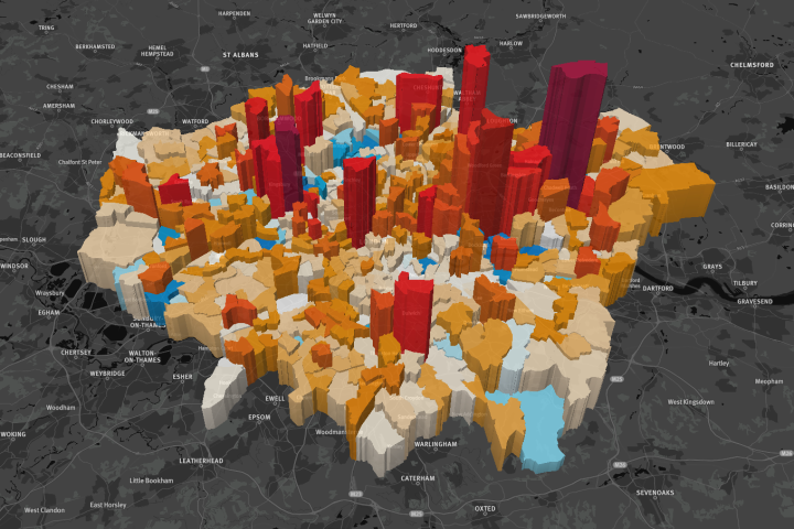
This map by data visualisation specialists Parallel shows how much the population is expected to grow in every ward in London, up until 2041. The darker red the bars are on the map, the more that area is expected to grow, with the Thames ward in Barking and Dagenham set to grow by 466% during that time. Meanwhile in blue areas the populations are predicted to decrease, with the Northolt West End ward to decrease by 9.1%.
The visualisation is built around the GLA Population and Household Projections data found here. Click on the map above for the full interactive version – use the slider to change the year shown and right-click to rotate the map.
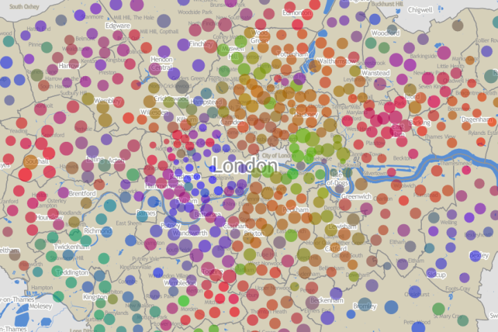
What kind of people live there?
London area classifications
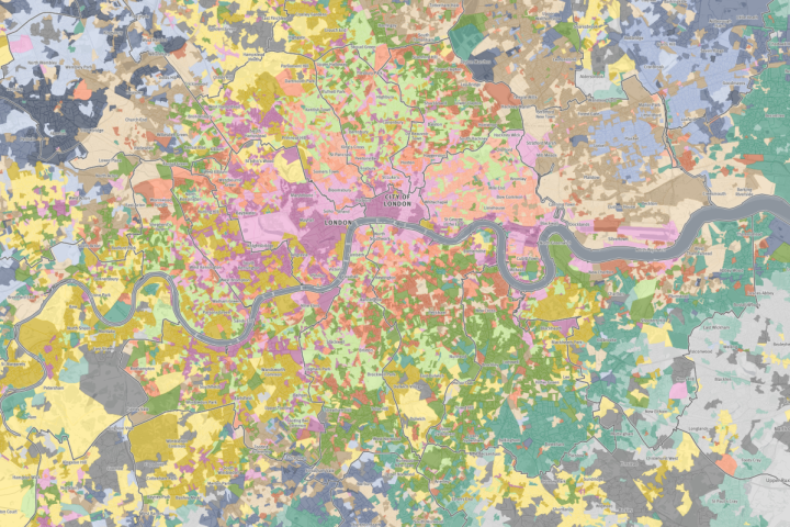
Another Parallel creation, this map shows the majority people groups living in every area in London. The pink shades represent urban elites, the oranges are mainly high density and high-rise housing, and the greens indicate graduate, City worker and student fringe enclaves.
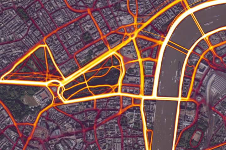
Which areas have the best air quality?
Atmospheric emissions

Our recent How London Lives report found that London's buyers and renters are increasingly concerned with living in a healthy environment with plenty of outdoor space. This map shows emission levels around London, revealing the city's best and worst areas for clean air.
The higher, dark red spikes show the highest emissions of nitrogen dioxide, with major emissions hotspots including the Hammersmith flyover and Heathrow airport. Air quality can be seen to improve dramatically south and west of Putney, while Hyde Park provides a central haven from airborne pollutants.
Where do people run/cycle the most?
Strava Heatmap
The desire for outdoor exercise options is also a growing trend identified in our How London Lives report. This fascinating heatmap uses data from the Strava exercise app to show the most popular routes used by runners, cyclists, and even swimmers in the city. Zoom out and view exercise hotspots around the world.
3-bed flats under £500k within 30mins of the City
Foxtons property search
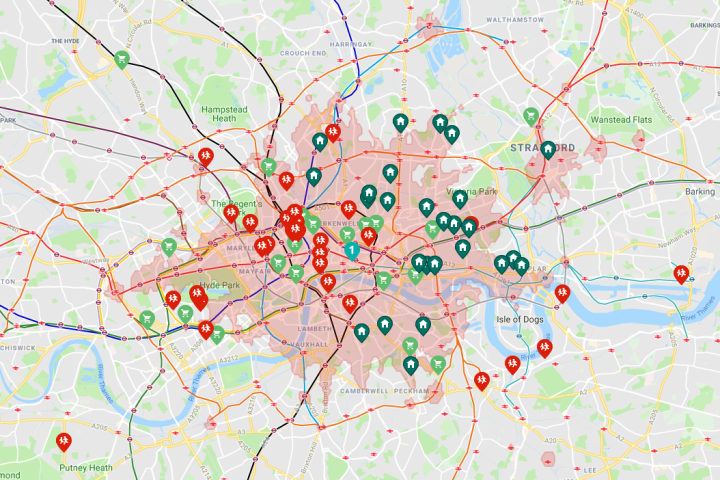
Our own interactive search map includes a variety of options to help you narrow down your search for sales, rental or short let properties in London and the Home Counties.
On the example above, property within the pink areas have a commute time of 30 minutes or less from St Paul's Cathedral. The dark green markers within that zone have been filtered to show only 3-bedroom flats for under £500,000, while universities are shown in red and supermarkets in light green.
Where are London's most peaceful green spaces?
Tranquil Pavement
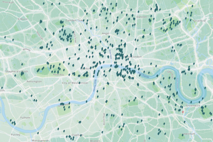
The Tranquil Pavement map relies on feedback from Londoners to tag the best areas for escaping the hustle and bustle of city life. Clicking on each marker brings up a photo and description of the area, indicating London's top spots for a bit of peace and quiet.
How do people vote there?
London's new political colour
This striking map shows local election results for all 600 London wards. Three colours are blended to indicate Labour/Conservative/other votes, illustrating the variety of political affiliations across the city. It was created by Oliver O'Brien, a Researcher at the UCL Department of Geography – visit his blog here for more information on how the map was made.
Oliver is also the editor of Mapping London, which inspired this post and curates a huge selection of the most creative and insightful London maps.


